
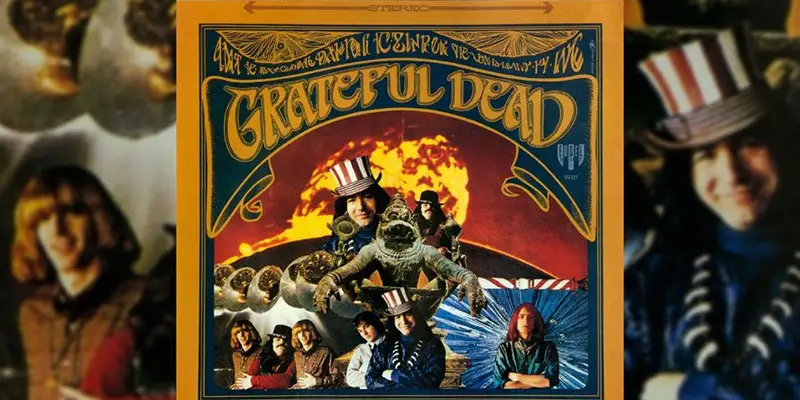
The Grateful Dead font is based on the lettering on the cover of the Grateful Dead band’s first album, which came out in 1967. Grateful Dead was also the name of the album.
The font used in the album art design for the word “Grateful Dead” is in high demand because of its popularity. The majority of the time, people search for this art lettering as “The Grateful Dead font.”
What font does The Grateful Dead’s first album cover use?
We found there fonts that are very similar to the Grateful Dead album art.
Harbinger font, designed by David F. Nalle for the Scriptorium Font Library in 1994, is the first font that looks very similar to the album art lettering. The font was inspired by album design, and it’s free for personal use. See the comparison below.

The other one is BlackBeard Font designed by Kalynn Campbell for Roulette Studios published in 2000. In 2008, the font was updated. See the comparison below.

There is also a strong similarity between the Hoffman font and the font published by Rick Mueller in 1999. Check out the below image for more comparisons. It’s a truetype freeware font.
Grateful Dead Font Generator
Conclusion,
The Grateful Dead font is a term that refers to the distinctive lettering on the cover of the band’s first album from 1967. Some similar fonts replicate this custom design, which isn’t an official typeface. Three examples of fonts that resemble the Grateful Dead font are Harbinger, Hoffman and BlackBeard, which are available for personal use. These fonts capture the psychedelic and artistic style of the band and its fans.
Hope you find the answer you are looking for. If you have any suggestions or opinions on this information please feel free to comment.
Please check out our other free fonts like Soul Train, Six Caps and Toy Story Font.