
Are you a designer on the hunt for the Taco Bell font? Or maybe you’re just a fan of the fast-food giant’s iconic branding and want to add a touch of its distinctive style to your graphic design work? Either way, we’ve got you covered. Taco Bell is known for its distinctive logo, which features a stylized bell and the words “Taco Bell” in bold and rounded font. However, Taco Bell has always used custom typefaces. Several different typographies were used before the brand found its current style. This font is simple, streamlined, and sans serif type, with block capitals. But this font isn’t available to the public. However, we were able to find similar fonts that could give the same vibe as the logo font. Learn and know about it by staying with us. But first let’s get to know about Taco Bell.
What Is Taco Bell?
Taco Bell, the fast-food chain specializing in Mexican-inspired cuisine, has a long and interesting history. The company was founded in 1962 by Glen Bell in Downey, California. Bell was originally a hot dog vendor who noticed the popularity of Mexican food in the area and switched to serving tacos. The first Taco Bell restaurant was a small stand that served hard-shell tacos for 19 cents each.
Over the years, Taco Bell expanded rapidly, becoming a major player in the fast-food industry. The company was acquired by PepsiCo in 1978 and continued to grow, introducing new menu items like the Crunchwrap Supreme and the Doritos Locos Tacos. In 2015, Taco Bell spun off into its own company, and today it has over 7,000 locations worldwide.
Throughout its history, Taco Bell has been known for its innovative and sometimes controversial marketing campaigns, as well as its distinctive branding and logo. But despite the changes and challenges over the years, Taco Bell remains a beloved and popular fast-food destination for millions of customers around the world.
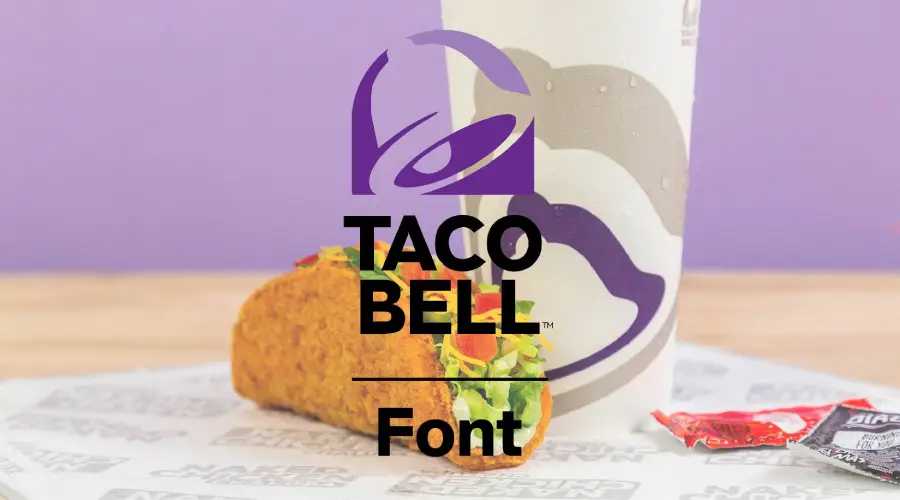
About Taco Bell Logo Font
Taco Bell not only attracts people with it’s food but also with its eye-catching logo. The logo has gone through a few iterations over the years, but its unique style remains consistent. It’s a testament to the power of good branding and how it can help a company stand out in a crowded market. But every font they used in their logo is a custom-made font specifically made for the company. So it isn’t available to people. But we found a font that looks very similar to the current font on the logo. It is called Atkinson Hyperlegible. You can see how similar they look in every aspect from the image below except the word “E”.
Atkinson Hyperlegible Font Features
The Braille Institute of America developed the Atkinson Hyperlegible font in collaboration with Applied Design Works. It has been developed specifically to increase legibility and readability for readers with low vision, and to improve comprehension. Atkinson Hyperlegible has four styles: regular, italic, bold, and bold italic. It has 335 glyphs per font, and supports 27 languages with accent characters. Atkinson Hyperlegible has a monolinear and geometric look, with a moderate contrast between thick and thin strokes. It has a large x-height and a moderate character width, which makes it efficient for screen space and easy to read on both print and screen. Atkinson Hyperlegible also has some distinctive features, such as:
- Recognizable footprints: The character boundaries are clearly defined, ensuring understanding across the visual-ability spectrum.
- Differentiated letterforms: Similar letter pairs are differentiated to dramatically increase legibility. For example, the lowercase l has a curved tail, the uppercase I has serifs, the lowercase i and j have square dots, and the uppercase Q has a diagonal stroke.
- Unambiguous characters: The shapes of certain letters are exaggerated or modified to provide better clarity and distinction. For example, the lowercase e and g have shortened tails, the lowercase a and e have open forms, and the uppercase G and R have curved spurs.
- Circular details: The dots on the lowercase i and j, as well as the punctuation marks, are circular instead of square. This links to the history of Braille Institute and Braille dots.
Atkinson Hyperlegible has a neutral and clean feel, while also being elegant and timeless. It can adapt to different moods and tones depending on the style and context. Atkinson Hyperlegible is suitable for both formal and informal situations, as well as for both technical and artistic purposes.
Where Can You Use This Font
The beauty of the Atkinson Hyperlegible font lies in its versatility! You can use this font in various ways, making it an excellent choice for any designer or brand. If you’re looking for a font that will give your website a professional and sleek look, Atkinson Hyperlegible is the way to go. It’s perfect for headings, titles, menus, and buttons, making it an ideal choice for web designers.
And if you’re looking to create a reliable and elegant identity for your brand, Atkinson Hyperlegible can do just that. It’s a great option for brands in the technology, education, health, or finance industries. Pair it with other fonts to create contrast and hierarchy, and you’ll have an identity that stands out from the crowd.
But it’s not just limited to digital use! Atkinson Hyperlegible is also perfect for print materials such as books, magazines, flyers, and posters. The font’s clean and crisp lines make it easy to read. Even in small sizes, which is essential for any print material.
Taco Bell Font Generator
Font View

Similar Fonts
If you’re looking for fonts similar to the Taco Bell logo font, there are a few options available that can give you a similar vibe. One popular option is the font “Cheddar Gothic Bold” by James T. Edmondson. It’s a bold, sans-serif font with rounded edges and blocky capitals that resemble the Taco Bell logo font. It’s available for purchase on various font websites.
Another option is the “VAG Rounded” font by Volkswagen AG. It’s a rounded sans-serif font that has a similar feel to the Taco Bell logo font, but with more curves and a slightly different style. It’s a versatile font that can work well for branding and other design purposes.
Are you looking for a free option? Then “Fredoka One” font by Milena Brandao is a fun and playful font that has a similar vibe to the Taco Bell logo font. It’s a rounded sans-serif font with bold, blocky capitals and rounded edges that make it a good choice for titles and headlines.
In conclusion,
While the Taco Bell logo font is a custom typeface that isn’t available to the public, there are plenty of similar fonts that can give you a similar look and feel. Whether you’re a designer looking for inspiration or a fan of Taco Bell’s distinctive branding, these fonts can help you add a touch of the fast-food giant’s iconic style to your work. So, experiment with these fonts and find the one that suits your needs the best!
And if you liked this one and want to know about some other fonts then check out our Grateful Dead, Rolls Royce, and Austin Powers fonts.
Thank you for reading!