
Did you know that the Arial font you’re reading right now is part of the neo-grotesque style, designed for Monotype Typography back in 1982? That’s right! Arial is one of the most popular and ubiquitous fonts in the world, and you’ve probably seen it everywhere from billboards to computer screens. Its sleek, modern design and clean lines make it a go-to choice for everything from professional documents to personal correspondence. Arial actively appears in all versions of Microsoft Windows, numerous other Microsoft software applications, as well as Apple’s macOS and many PostScript 3 computers. It also functions as a web-safe font, capable of displaying on any browser or device.. And today we will learn about the history of the font and everything about it.
History of Arial Font
The origin of Arial can be traced back to the 1970s when IBM commissioned Monotype to create a typeface for its new laser printers. Monotype decided to base the design on Helvetica, a popular and well-known typeface created by Max Miedinger and Eduard Hoffmann in 1957. Helvetica was inspired by Akzidenz-Grotesk, a classic German typeface from the late 19th century.
However, Helvetica was not available for IBM’s use due to licensing issues. Monotype had to create a new typeface that was metrically compatible with Helvetica, meaning that each character had the same width and height as its counterpart in Helvetica. This way, a document designed in Helvetica could be printed with Arial without changing the layout or spacing.
Monotype assigned Robin Nicholas and Patricia Saunders to work on the project, which was initially called Sonoran Sans Serif. They used Monotype Grotesque, another typeface from the neo-grotesque style, as a reference for some of the design details, such as the diagonal terminal strokes and the curved tails of some lowercase letters. They also modified Arial from Helvetica, such as making the capital R more curved, the lowercase a more open, and the lowercase g more double-story.
The first version of Arial was released in 1982 for IBM’s use only. It had four styles: Regular, Italic, Bold, and Bold Italic. In 1987, Monotype released Arial publicly as part of its TrueType Font Pack for Windows 3.1. Since then, Arial has been expanded to include many more styles and variants, such as Narrow, Black, Rounded, and Monospaced. Arial has also been updated to support a large set of international characters and symbols, such as Arabic, Hebrew, Cyrillic, Greek, Thai, Chinese, Japanese, Korean, and more.
Features of Arial Font
Arial is a typeface with many features suitable for various applications and purposes. Some of these features are:
- Humanist characteristics: Arial contains more humanist characteristics than many of its predecessors and as such is more in tune with the mood of the last decades of the twentieth century. The overall treatment of curves is softer and fuller than in most industrial style sans serif faces. Terminal strokes are cut on the diagonal which helps to give the face a less mechanical appearance.
- Legibility: Arial is designed to be easy to read at large and small sizes and in a variety of contexts. It has clear and simple shapes that are well-balanced and harmonious. It also has generous spacing between letters and words that enhances readability.
- Versatility: Arial is an extremely versatile family of typefaces that can be used for text setting in reports, presentations, magazines, etc., and for display use in newspapers, advertising and promotions. It has a range of styles and weights that can create contrast and hierarchy within a document or design. It also has a neutral and modern appearance that can adapt to different moods and tones.
Usage of Arial
Because it is easy to read at large and small sizes and in a variety of applications, Arial has been a staple screen font for decades. Arial is also used in many logos and informational material, such as booklets, educational aids and instruction manuals. Arial is also popular for advertising, book design and office communication. The availability of many narrow widths also makes the typeface suitable for posters and large print ads. In smaller point sizes, Arial is popular for diagram annotations and is an easy-reading typeface for books.
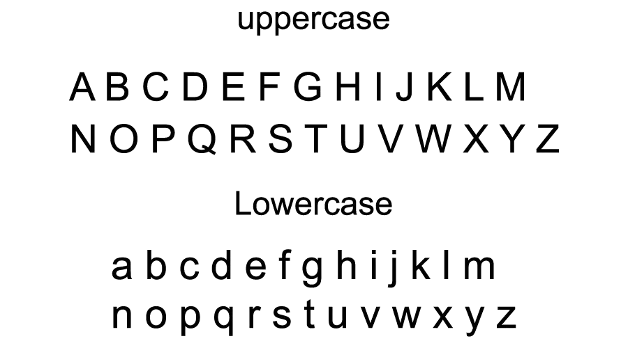
Font View

Similar Fonts
Arial is not the only typeface that belongs to the neo-grotesque style and has a similar appearance to Helvetica. Users have many options to choose from when looking for an alternative or substitute to Arial. Different fonts can be considered depending on the user’s preference and purpose. Some of these fonts are:
- Helvetica: Helvetica is the most obvious and famous alternative to Arial, as it is the original typeface that inspired Arial’s creation. Helvetica is widely regarded as a classic and timeless design that has influenced many other typefaces. It has a slightly more elegant and refined look than Arial, with more consistent and harmonious strokes. Helvetica also has a larger family of styles and variants than Arial, including Neue Helvetica, Helvetica Now, and Helvetica World.
- Calibri: Calibri is another sans-serif typeface that was designed by Lucas de Groot for Microsoft in 2004. It replaced Arial as the default typeface in Microsoft Office 2007 and later versions. Calibri has a more humanist and friendly feel than Arial, with softer curves and rounded corners. It also has a higher x-height and narrower width than Arial, which makes it more compact and efficient for text setting. Calibri has six styles: Regular, Italic, Bold, Bold Italic, Light, and Light Italic.
- Myriad Pro: Myriad Pro is a sans-serif typeface that was designed by Robert Slimbach and Carol Twombly for Adobe in 1992. It is a versatile and professional typeface that can be used for both text and display purposes. Myriad Pro has a more organic and dynamic look than Arial, with subtle variations in stroke weight and contrast. It also has a larger x-height and wider apertures than Arial, which enhances its legibility and clarity. Myriad Pro has a rich family of styles and variants, including condensed, semi-condensed, extended, semi-extended, and rounded versions.
Conclusion
Arial is a typeface that has been widely used and recognized for decades. It is a simple and functional design that can suit various needs and contexts. However, it is not the only option for users who are looking for a sans-serif typeface with similar characteristics. There are many other fonts that can offer different features and qualities that may be more suitable or appealing for different purposes. By exploring these alternatives, users can find the best typeface for their projects and preferences.
If you liked this and looking for more fonts then check out our Bluey, Frozen, and Spongebob fonts now!
Thank you.