
Avenir is a geometric sans-serif typeface that was designed by Adrian Frutiger in 1987 and released by Linotype in 1988. The name Avenir means “future” in French and reflects the designer’s intention to create a modern and elegant typeface that would stand the test of time. Adrian Frutiger designed Avenir, a geometric sans-serif typeface, in 1987 and Linotype released it in 1988. Frutiger intended to create a modern and elegant typeface that would stand the test of time, hence the name “Avenir,” meaning “future” in French. Avenir incorporates some humanist and organic elements that make it more suitable for extended text and harmonious headlines, while drawing inspiration from the geometric style of sans-serif typefaces that emerged in the 1920s, including Erbar and Futura. Designers widely use Avenir in corporate branding, logo design, signage, and editorial design, praising it as one of the most beautiful and versatile typefaces ever created.
History of Avenir Font
Swiss type designer Adrian Frutiger created some of the most iconic and influential typefaces of the 20th century, including Univers, Frutiger, and Avenir. Throughout his career, he passionately explored sans-serif typefaces and developed innovative styles and concepts. In 1988, he finally realized his long-held ambition to design a linear sans-serif typeface that would combine the clarity and simplicity of geometric forms with the warmth and readability of humanist shapes.
Frutiger started working on Avenir in 1985, after he moved to France and established his own studio. He wanted to create a typeface that would be “a synthesis of past experience and an anticipation of future possibilities”. So, he studied the works of Paul Renner, the designer of Futura, and Edward Johnston, the designer of the London Underground typeface, and drew inspiration from their use of geometric proportions and optical corrections. He also looked at historical examples of geometric lettering, such as ancient Greek inscriptions and Roman capitals.
Frutiger designed Avenir with a grid system that defined the basic shapes and proportions of each letter. Then he refined each character by adding subtle curves, angles, and variations that gave them more personality and dynamism. He also adjusted the stroke widths, contrast, and spacing to achieve a balanced and consistent appearance across different weights and styles. He described his process as follows:
Avenir Later
Avenir was originally released in 1988 in three weights: book, roman, and heavy.E each with a corresponding oblique version. Frutiger used a two-digit numbering system to name the fonts: 45 for book, 55 for roman, 85 for heavy, and 46, 56, and 86 for their obliques. He also designed the fonts with different stroke widths for different applications. The book weight was intended for body text. The roman weight for captions and subheadings, and the heavy weight for headlines and display purposes.
The original Avenir family was later expanded to six weights: light, book, roman, medium, heavy, and black, each with an oblique version. Frutiger also added additional features to the fonts, such as small caps, ligatures, and alternate characters.
In 2004, Frutiger collaborated with Akira Kobayashi, a Japanese type designer who worked for Linotype, to revise and extend the Avenir family. The result was Avenir Next, a new version that added four new weights: ultra light, thin, demi bold, and bold, and two new widths: normal and condensed. Avenir Next also included more glyphs, such as Greek and Cyrillic characters, and improved kerning and hinting. Frutiger’s numbering system was dropped, and the designers gave the new fonts more conventional weight names like light, regular, medium, etc.
Linotype released Avenir Next as part of its Platinum Collection, which consisted of a series of high-quality typefaces designed or updated by renowned designers. It became one of Linotype’s best-selling fonts and received several awards.
Avenir Font Attribute
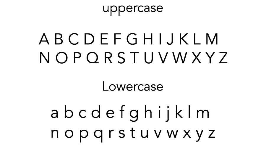
Avenir is a sans serif typeface that belongs to the geometric style, which means that it is based on simple geometric shapes, such as circles, squares, and triangles. However, unlike other geometric typefaces, such as Futura or Erbar, Avenir is not purely geometric; it has some humanist features that make it more organic and friendly.
Some of the distinctive features of Avenir are:
- The vertical strokes are thicker than the horizontal ones, which gives the typeface a more stable and balanced look.
- The letter “o” is not a perfect circle, but slightly oval, which reduces the optical illusion of a gap in the middle.
- The ascenders and descenders are shortened, which allows for tighter line spacing and better readability.
- The letters “a” and “t” have a two-storey design with a curl at the bottom, which adds some contrast and elegance to the typeface.
- The letters “g” and “y” have a single-storey design with a curved tail, which makes them more legible and harmonious with the other letters.
- The letters “e” and “s” have a slightly tilted axis, which gives them more dynamism and movement.
- The letters “Q” and “R” have a distinctive tail that extends beyond the baseline, which adds some flair and uniqueness to the typeface.
Avenir has a wide range of weights and styles that can be used for different purposes and contexts. The original Avenir family consists of six weights: light, book, roman, medium, heavy, and black, each with an oblique version. The revised Avenir Next family adds four more weights: ultra light, thin, demi bold, and bold. And two more widths: normal and condensed. Avenir Next also includes more glyphs, such as Greek and Cyrillic characters, small caps, text figures, subscript and superscripts, and ligatures.
Usage of Avenir Font
Avenir is one of the most popular and versatile typefaces in the world. Many well-known companies and organizations choose Avenir for their visual identity, making it a widely used typeface in corporate branding, logo design, signage, and editorial design.Some examples of Avenir font usage are:
- Dwell magazine switched to Avenir during a 2007 rebrand.
- Key Bank adopted Avenir for advertising and in-bank signage.
- Japan Airlines, Banrisul, Scottish Water, Susquehanna International Group, and Red Lion Hotels use Avenir for corporate branding.
- Avenir is employed on signage at Dallas Fort Worth and Hong Kong international airports.
- The city of Amsterdam adopted Avenir as its corporate typeface in 2003.
- The Girl Scouts of America created a modified version of Avenir for its 2010 rebrand.
- LG Electronics uses Avenir extensively in branding, advertising and hardware such as cell phone keypads.
Avenir is also a favorite typeface among designers and typographers who appreciate its beauty and functionality. You can use it for various purposes, such as headlines, subheadings, body text, captions, quotes, lists, tables, charts, diagrams, labels, buttons, menus, forms, logos, icons, etc. It can be combined with other typefaces, such as serif or script fonts, to create contrast and hierarchy. You can also customize it with different colors, sizes, alignments, spacing, kerning, tracking, etc., to create different effects and expressions.
Avenir is a typeface that can communicate effectively and elegantly in any situation and medium. It is a typeface that reflects the past and anticipates the future. It is a typeface that deserves its name.
Avenir Font Generator
Font View

Conclusion
Designers widely use Avenir in corporate branding, logo design, signage, and editorial design due to its versatility and elegance. Avenir has earned high praise from designers as one of the most beautiful and adaptable typefaces ever created. Avenir is a typeface that combines the clarity and simplicity of geometric forms with the warmth and readability of humanist shapes. It is a typeface that reflects the past and anticipates the future. It is a typeface that deserves its name.
If you liked this and looking for more fonts then check out our Bluey, Frozen, and Spongebob fonts now!
Thank you.