
Quick answer: The DIN Condensed font usually means DIN 1451 Engschrift, the narrow German road-sign lettering. The best free copy is D-DIN Condensed, made for Datto and released under the SIL Open Font License. Barlow Condensed, Saira Extra Condensed and Oswald are free look-alikes, and you can try all four in the generator below.
- D-DIN CondensedFree, including commercial use
Closest free copy of the DIN style (Bold file also hosted)
DIN Condensed- Personal use
- Yes
- Commercial use
- Yes
- Web embedding
- Yes
SIL Open Font License · Source: github.com · checked 9 Nov 2026
By Datto Inc., made by Monotype
- Barlow CondensedFree, including commercial use
Look-alike, not the same letters (rounder)
DIN Condensed- Personal use
- Yes
- Commercial use
- Yes
- Web embedding
- Yes
SIL Open Font License · Source: fonts.google.com · checked 9 Nov 2026
By Jeremy Tribby
- Saira Extra CondensedFree, including commercial use
Look-alike, not the same letters (narrower, techy)
DIN Condensed- Personal use
- Yes
- Commercial use
- Yes
- Web embedding
- Yes
SIL Open Font License · Source: fonts.google.com · checked 9 Nov 2026
By Omnibus-Type
- OswaldFree, including commercial use
Look-alike, not the same letters (taller, rounder)
DIN Condensed- Personal use
- Yes
- Commercial use
- Yes
- Web embedding
- Yes
SIL Open Font License · Source: fonts.google.com · checked 9 Nov 2026
By Vernon Adams, Kalapi Gajjar, Cyreal
- D-DIN CondensedDIN Condensed
- Barlow CondensedDIN Condensed
- Saira Extra CondensedDIN Condensed
- OswaldDIN Condensed
Licence notes are a summary; read the font’s own licence before commercial use.
DIN Condensed Font Generator
DIN Condensed Font Generator
Free fonts
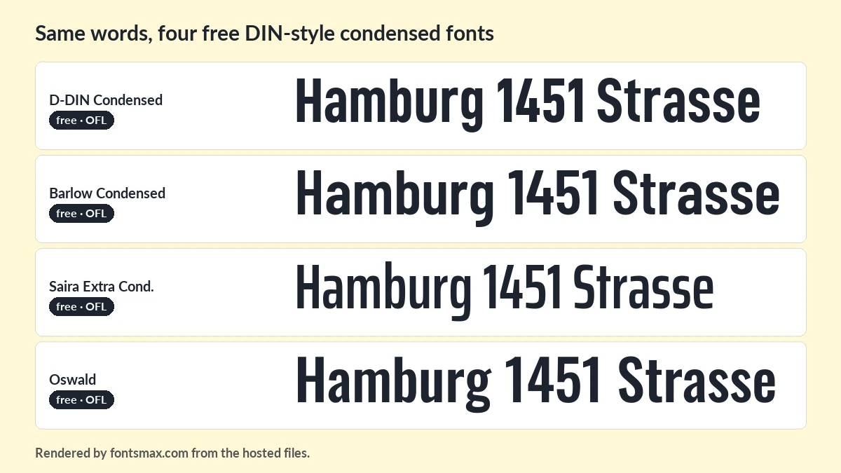
D-DIN Condensed is the closest. The other three are look-alikes, not the same letters. All four are under the SIL Open Font License.
What DIN 1451 is
DIN 1451 is a lettering standard written by the German standards institute in 1931. The narrow version, Engschrift, traces back to Prussian railway lettering from 1905. The plain version is called Mittelschrift.
You see it on road signs in Germany and other countries. German licence plates used it too, from 1956 right up to early 1995. Many digital versions exist, including Microsoft’s Bahnschrift from 2016 and open projects such as OSP-DIN and Gidole.
Datto, a US data backup company, uses a DIN style as its corporate font. It commissioned Monotype to draw several styles and released them as D-DIN in 2017, under the OFL. The family has normal, condensed and expanded widths, and the condensed one is the one this page is about.
One thing to watch: some download sites label D-DIN “personal use only”. The project’s own FONTLOG says Datto commissioned the fonts to be open sourced under the SIL Open Font License, and that licence allows commercial use. If a site shows different terms, trust the licence file that ships with the font.
Which free fonts match it
I checked each candidate against Bahnschrift, Microsoft’s own digitisation of DIN 1451 Engschrift, on a contact sheet. D-DIN Condensed Bold lined up almost letter for letter, down to the shape of the g and the numbers. Barlow Condensed was next. Its curves are a little rounder.
- D-DIN Condensed comes in regular and bold. It is the one to use if you want the real DIN look.
- Barlow Condensed has many weights and is easy on the eye in long headlines.
- Saira Extra Condensed is narrower, with a techy edge.
- Oswald is taller and rounder, so it works as a look-alike when you need the same narrow feel.
The Windows font Bahnschrift is already on many PCs, but Microsoft does not allow it to be passed on, so I do not host it here.
Picking one for your project
| Job | Pick | Why |
|---|---|---|
| Road-sign style graphic | D-DIN Condensed | Closest to the real letters. |
| Poster headline | Barlow Condensed | Sturdy and flexible. |
| Packaging or label | Saira Extra Condensed | Fits long names in little space. |
| Web page heading | Oswald | A familiar font that loads fast. |
If you like tight, technical lettering, the Eurostile font page has the wide opposite. For brand lettering ideas, try the Nike font page.
A condensed face saves space, but it needs air. Add a little letter spacing for small sizes, and use the bold file for signs that people read from far away. In all caps, DIN-style letters look tidy and official.
DIN condensed font questions
Is DIN Condensed free?
The original standard lettering has no single file. D-DIN Condensed is a free, OFL-licensed font based on the DIN style, and you can download it here.
What is the free alternative to DIN 1451 Engschrift?
D-DIN Condensed. Barlow Condensed and Oswald are look-alikes.
Is Bahnschrift the same as DIN?
Bahnschrift is Microsoft’s digitisation of DIN 1451, in both the Mittelschrift and Engschrift widths. It ships with Windows, and its licence does not allow sharing.
Is there a DIN condensed font generator?
Yes, the one above. Type your words, pick a font and save a PNG.
Can I use D-DIN in Canva?
Yes, if you have a Pro plan to upload fonts (see the Canva font guide for the steps). The OFL allows commercial use, so you can use it in your designs.
I keep coming back to D-DIN Condensed when a layout needs to feel organised. Try it in bold for signs. More typefaces are in the design fonts section.
More Design fonts
 Chrome Hearts Font Download Free
- Magic Owl Font
- Hot Wheels Font
- Bangers Font
- Yeezy Font
- Cyberpunk Font Free Download