
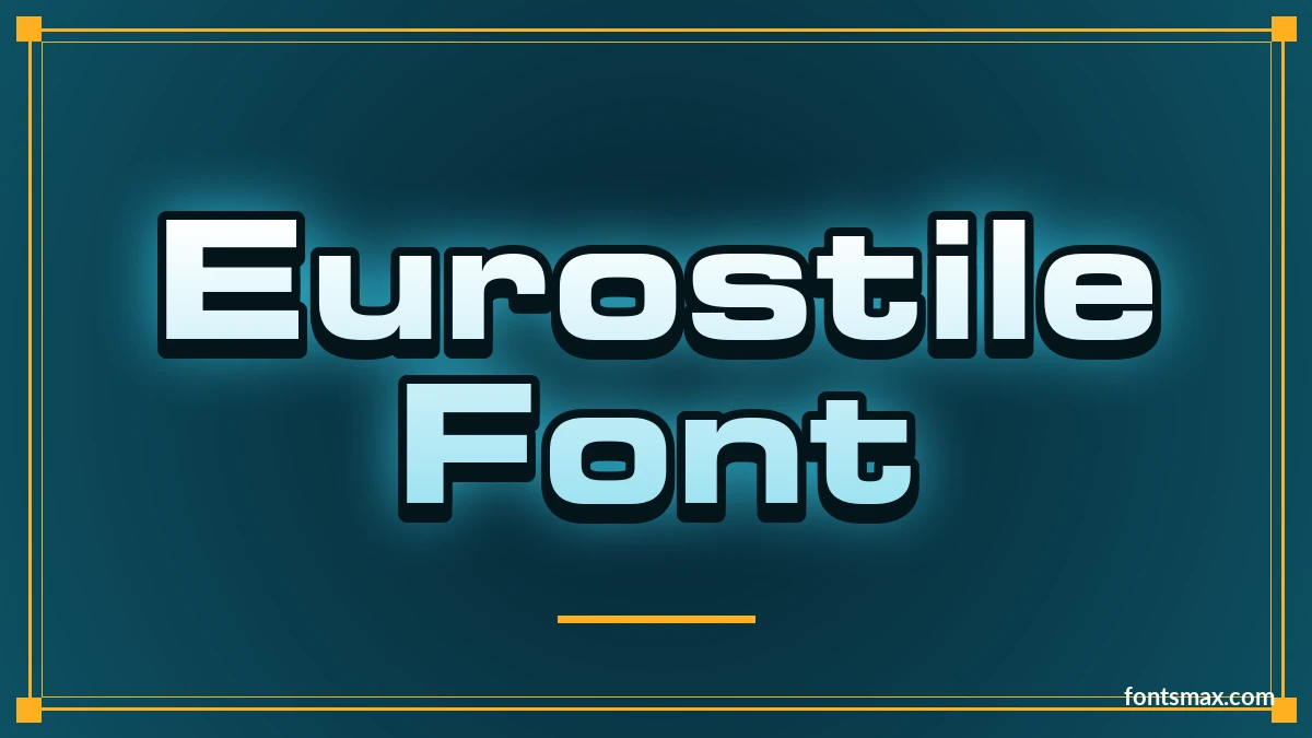
Quick answer: The Eurostile font is a wide, squared-off sans serif that Aldo Novarese drew for the Nebiolo foundry in 1962. The real font is sold by Linotype, so I show a preview and link to the shop instead of giving the file away. Michroma is the free font built on it, and you can try it and three other free look-alikes in the generator below.
- Eurostile LT StdCommercial font, preview only
Bold Extended, preview only

- Personal use
- Needs a paid licence
- Commercial use
- Needs a paid licence
- Web embedding
- Needs a paid licence
Commercial font · Licence source not verified
By Aldo Novarese, Linotype
- MichromaFree, including commercial use
Closest in shape, built on Eurostile Extended (light weight)
Eurostile- Personal use
- Yes
- Commercial use
- Yes
- Web embedding
- Yes
SIL Open Font License · Source: fonts.google.com · checked 9 Nov 2026
By Vernon Adams
- SyncopateFree, including commercial use
Look-alike, not the same letters (wide and heavy)
Eurostile- Personal use
- Yes
- Commercial use
- Yes
- Web embedding
- Unknown, check the licence
Free for commercial use (author's words) · Source: fonts.google.com · checked 9 Nov 2026
By Astigmatic
- OrbitronFree, including commercial use
Look-alike, not the same letters (heavy, cut corners)
Eurostile- Personal use
- Yes
- Commercial use
- Yes
- Web embedding
- Yes
SIL Open Font License · Source: fonts.google.com · checked 9 Nov 2026
By Matt McInerney
- AldrichFree, including commercial use
Look-alike, not the same letters (light)
Eurostile- Personal use
- Yes
- Commercial use
- Yes
- Web embedding
- Yes
SIL Open Font License · Source: fonts.google.com · checked 9 Nov 2026
By MADType
- Eurostile LT Std
- MichromaEurostile
- SyncopateEurostile
- OrbitronEurostile
- AldrichEurostile
Licence notes are a summary; read the font’s own licence before commercial use.
Where Eurostile came from
Novarese worked on its predecessor, Microgramma, with Alessandro Butti in 1952. That font had capitals only. Eurostile added lowercase letters and more weights, and Nebiolo released it in 1962.
Linotype later reissued it. In 2008 Akira Kobayashi redrew the family as Eurostile Next, working from specimens of the original metal type.
The shape is a superellipse, a square with rounded sides. It looks like an old television screen, and that is why film and TV keep reaching for it.
Eurostile is a family. The Linotype version has eleven fonts, and Eurostile Next has fifteen, covering five weights, each cut in three widths. The preview here is Bold Extended, the wide heavy cut that most people mean when they say the name.
Where you have seen it
- Science fiction titles. Star Trek and Doctor Who credits are two examples.
- The 60 Minutes logo.
- Canadian banknotes and the Oklahoma state flag.
- Dell products, and some cars from Peugeot and Citroën.
For other screen-tech looks, see the Tron font, the Blade Runner font and the Cyberpunk font pages.
Which free font is closest

I rendered the same letters in a dozen free fonts and compared them against Eurostile Bold Extended on a contact sheet. These four were the ones worth keeping.
- Michroma has the same wide squares and round corners. Its stroke is light, so it matches the shape of Eurostile Extended but not the bold weight.
- Syncopate Bold is wide and heavy, which is the closest in weight. The letters are more geometric, and the S and R differ.
- Orbitron Black has the weight and squared curves, with cut corners that Eurostile does not have.
- Aldrich is a clean, light look-alike with small cut corners.
None of the four is a copy. Michroma is the only one whose maker built it on Eurostile, and the others are look-alikes with the same mood. Some lookalike lists rank Exo first on an automatic similarity score. I did not test it, so I kept to the four I laid over the original.
Which one for which job
- Logo or headline: Syncopate Bold, because the weight holds up at a distance.
- Sci-fi poster: Orbitron Black.
- Elegant title or product label: Michroma, with plenty of letter space. It also suits a small label or caption set next to a headline in Syncopate.
- Dashboards and small caps text: Aldrich.
Whichever you pick, give the letters room. Wide squared capitals look best with a little extra letter spacing, and all caps suit them better than long lower-case lines. Michroma and Aldrich are light, so avoid tiny sizes on a busy background.
Eurostile font questions
Is Eurostile free?
No. Eurostile from Linotype is a paid font. Michroma is a free font based on it.
What is the free version of Eurostile?
Michroma is the closest in shape. For a heavier look, try Syncopate Bold or Orbitron Black.
Is Square 721 the same as Eurostile?
Bitstream’s Square 721 is a close twin with slightly different proportions, according to Wikipedia. It is a paid font as well.
Can I download Eurostile here?
No. The page shows a preview only. The four fonts in the generator can be downloaded for free.
Is there a Eurostile font generator?
Yes, the one above uses free look-alikes. Type your text and save it as a PNG.
I used to think a look-alike was a poor second choice, but Michroma changed my mind for headlines. Try it with wide letter spacing. Browse more design fonts if you want another style.