
Mad Max is a series of action movies set in a post-apocalyptic world where gangs of marauders and scavengers fight for scarce resources. Thrilling car chases, explosive stunts, and gritty visuals make Mad Max movies captivating. But did you know that movies also have distinctive fonts? In this article, we will explore the fonts associated with the Mad Max franchise. And how they were used in the movie titles and logos.
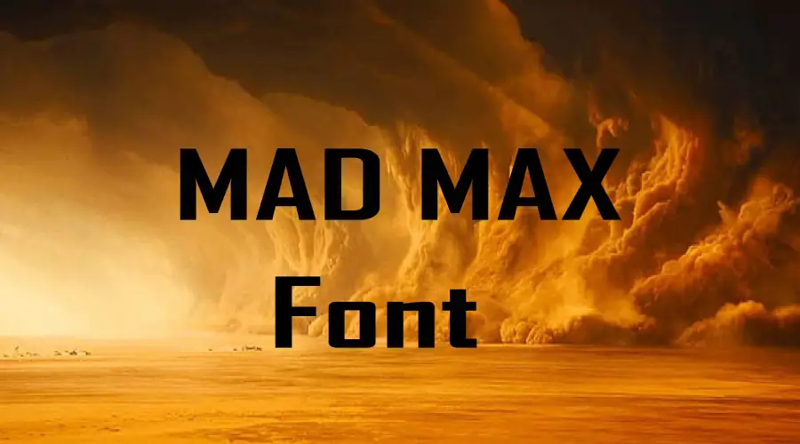
Family Regular
The first Mad Max movie was released in 1979 and introduced the world to Max Rockatansky. Max is a former police officer and when a gang of bikers kills Max’s family and he becomes a vigilante former police officer. The movie title used a font called Family Reporter, which is a slab serif typeface.
The font is based on an old typewriter font that was used in newspapers and magazines in the 1930s and 1940s. It has a vintage and retro feel, which suits the low-budget and gritty aesthetic of the first movie. The font also has some irregularities and rough edges, which add some character and dynamism to the title.
Agency FB: The Font of the Second Mad Max
The second Mad Max movie, also known as The Road Warrior, was released in 1981. It continued Max’s story as he helps a group of survivors defend their oil refinery from a horde of raiders led by Lord Humungus. The movie title used a font called Agency FB. Morris Fuller designed it as a sans-serif typeface and David Burlow redesigned it in 1990.

The font is based on an earlier font called Bureau Agency, which was created in 1932. It has a modern and sleek feel, which contrasts with the chaotic and dystopian setting of the movie. The font also has some sharp angles and narrow widths, which create a sense of tension and urgency in the title.
Modified Agency FB: The Font of Mad Max Fury Road
The “M” in the Mad Max: Fury Road logo is modified from the original Agency FB font. The modification adds some uniqueness and flair to the logo, as well as some symbolism. It was released in 2015 and followed Max as he joins forces with Furiosa. She is a rebel warrior who is trying to escape from the tyrannical Immortan Joe and his army of War Boys.
According to George Miller, the director of the movie, the cut on the “M” represents Max’s brokenness and his journey to redemption.
Mad Max Font Generator
Font View
Conclusion
Mad Max is a franchise that has distinctive fonts that reflect its style and tone. The fonts used in the movie titles and logos are Family Reporter, Agency FB, and Modified Agency FB. These fonts have different characteristics and histories that suit the different movies and their themes. We hope this article has given you some insight and information about these amazing fonts.
If you liked it then you can also check out our designs and fonts that you might like our American Horror Story, Moon Knight, and Bluey Font!
Thank you for Reading!