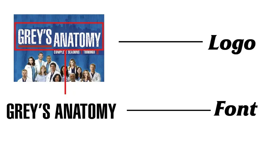
If you are a fan of medical dramas, you might know the Grey’s Anatomy logo. The logo features the title of the popular TV show. This follows the lives and careers of a group of doctors at a fictional hospital in Seattle. The logo uses a simple and elegant font that creates a professional and modern impression. This font is also called the Grey’s Anatomy font.
Font Used in Grey’s Anatomy Logo
Grey’s Anatomy is based on Helvetica Ultra Compressed font. Eduard Hoffmann and Max Miedinger designed it in 1957. Helvetica Ultra Compressed font is a variant of the Helvetica font, one of the most widely used fonts in the world. This font is known for its clean, crisp lines and tight letter spacing, making it a perfect choice for impactful headlines and titles. Many logos, headlines, posters, and books use Helvetica Ultra Compressed font, a classic design. Grey’s Anatomy modifies the Helvetica Ultra Compressed font for its version. It has some changes in the letter shapes and spacing to make it more suitable for the logo.

The font has a sleek and minimalist look that can be easily recognized. It has a single weight and style, with uppercase letters, numbers, and punctuation marks. The letters have straight and clean lines, creating a geometric and harmonious shape.
Effective Use of The Font
Helvetica Ultra Compress works well for a variety of design projects with its versatility. It fits headlines, posters, and banners where space is limited with its condensed form. It’s also suitable for logo design, particularly for brands seeking a modern, professional look. Furthermore, you can use it in video game design, internet images, t-shirts, and more, offering a wide range of applications for designers and typographers. The font can also work well with other fonts, especially those with a contrasting and complementary style.
Grey’s Anatomy Font Generator
Font View


Conclusion
Helvetica Ultra Compress is the font that has a very close match with Grey’s Anatomy Logo. This font is a great choice for anyone who wants to create a simple and elegant look for their text. It has a sleek and minimalist design that can catch attention and make an impact. It is also versatile and adaptable to different contexts and platforms. So, download it now and give it a try already!
If you’re interested in exploring more unique fonts, check out our Blackish, American Idol, and Miami Vice fonts.
Thank you very much for reading. Hope you enjoyed it!